
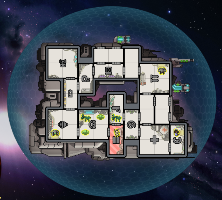
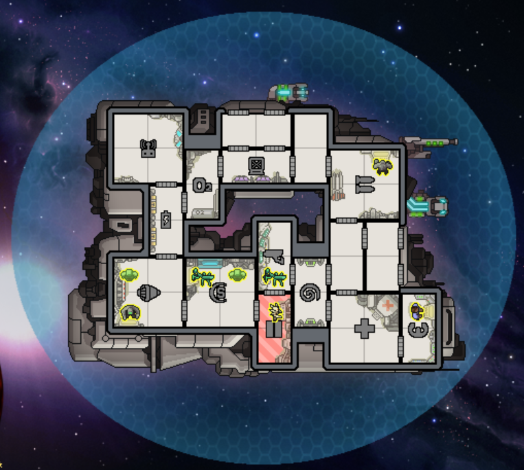
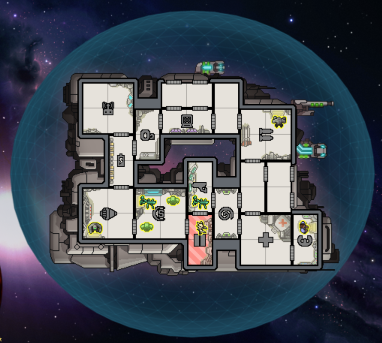
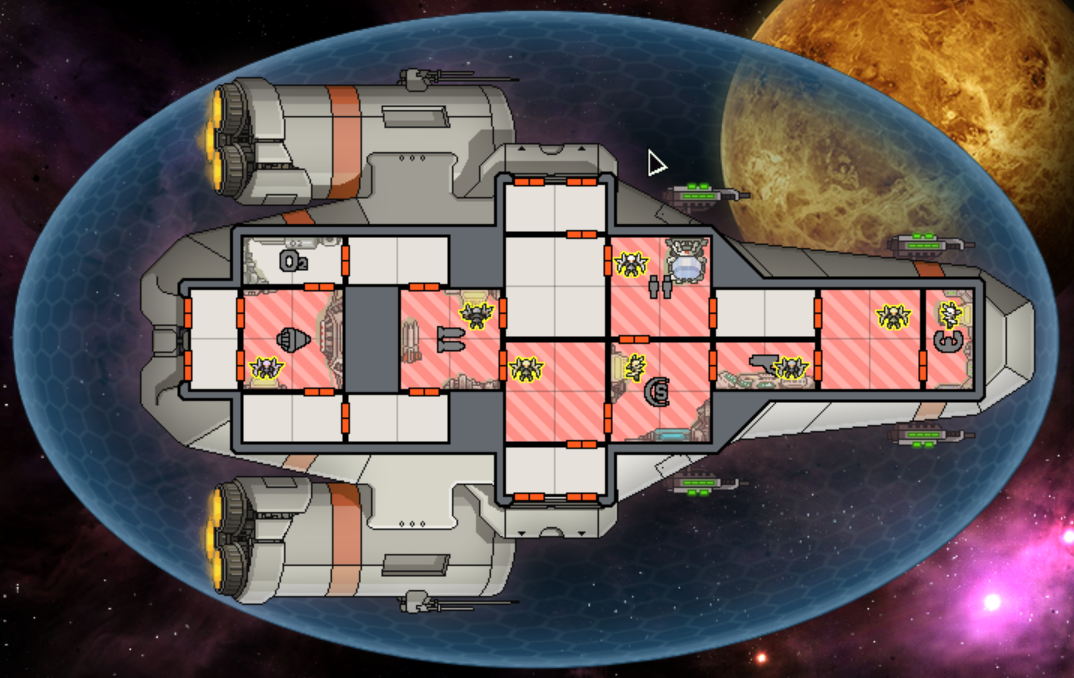
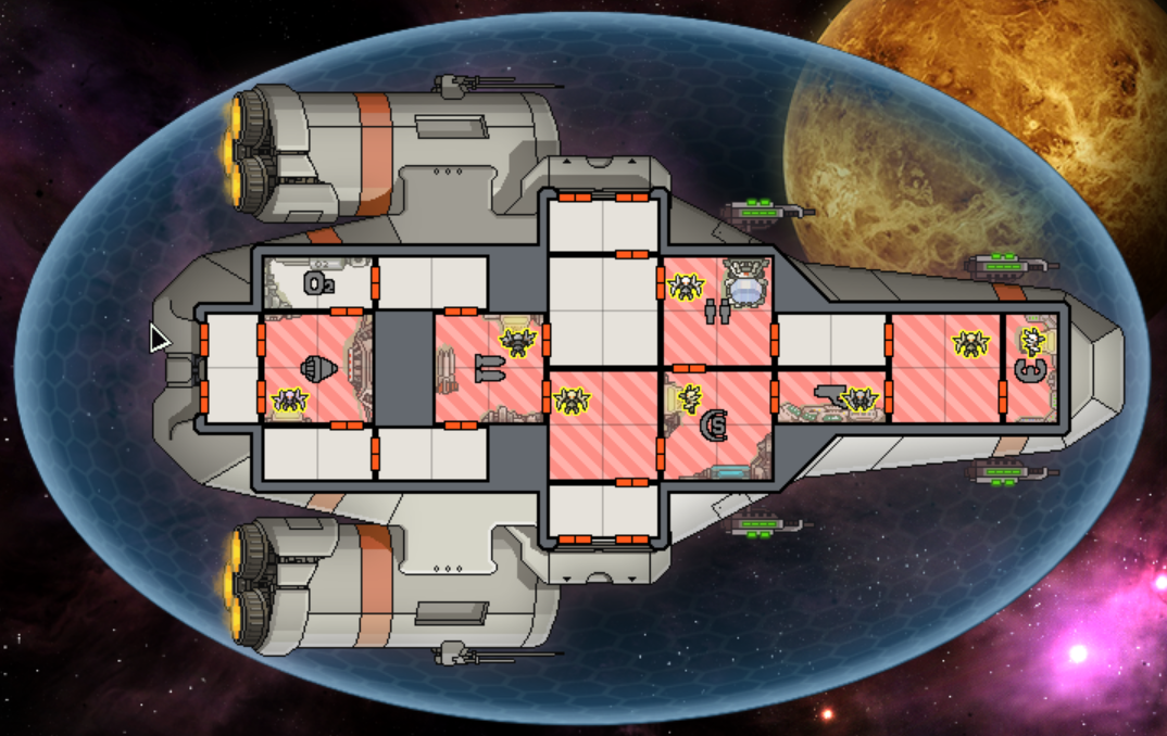
The idea is to make a hexagonal-pattern shield that stays as close in style to the original as possible, but looks better because it's 3D and has cleaner edges. Here is the Engi cruiser with max shields. The first image is my concept, the second is the original, and the third is Splette's:
If you want an easy way to compare the images, open them all in new browser tabs, then break these into a separate browser window. You can then CTRL-TAB between them.
Things that I could change:
- Thickness of the lines
- I could add a subtle glow/border around the edge (see Splette's hexagonal shield concept for an example)
- The transparency gradient (how sharply it fades off towards the centre)
- The relative intensity or colour of the lines, compared to the shield
- The overall brightness / contrast / hue / saturation
The image is based on a bevelled icosphere. As a result, I cannot change the size of the hexagons -- or rather, I can only have much bigger or much smaller hexagons. It also means the hexagons will be stretched on longer ships. And technically, there are a few pentagons in there, because it's impossible to make a sphere out of just hexagons -- but good luck spotting them!
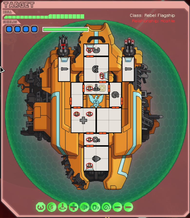
I've also tried applying this to the enemy ship shields. It's never going to look perfect, because enemies use a single shield image that gets resized. The enemy shield image is also more saturated/brighter than the player shields, and I think that looks better in-game against the background of the targeting frame.
The first image is my new shield applied to enemies, without adjustments (and against my cleaner enemy frame). The second image is the original shield (and frame), and the third image is my shield with the saturation/lightness boosted.
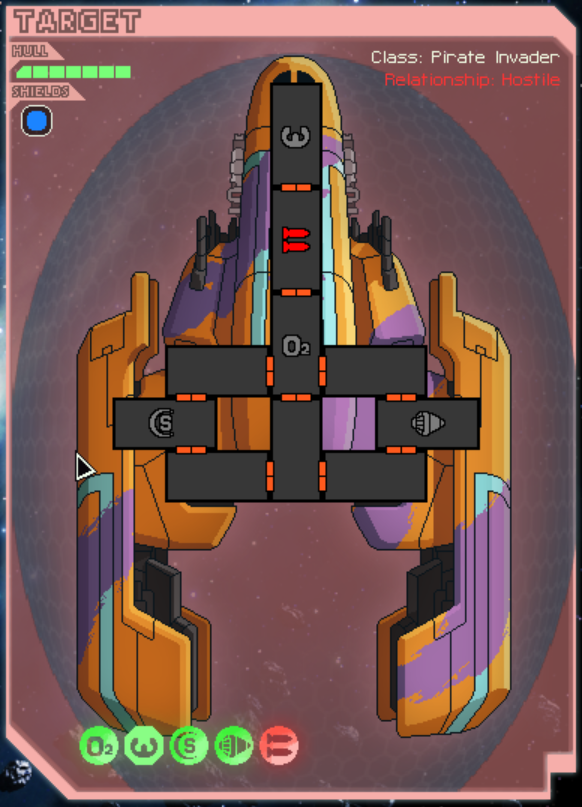
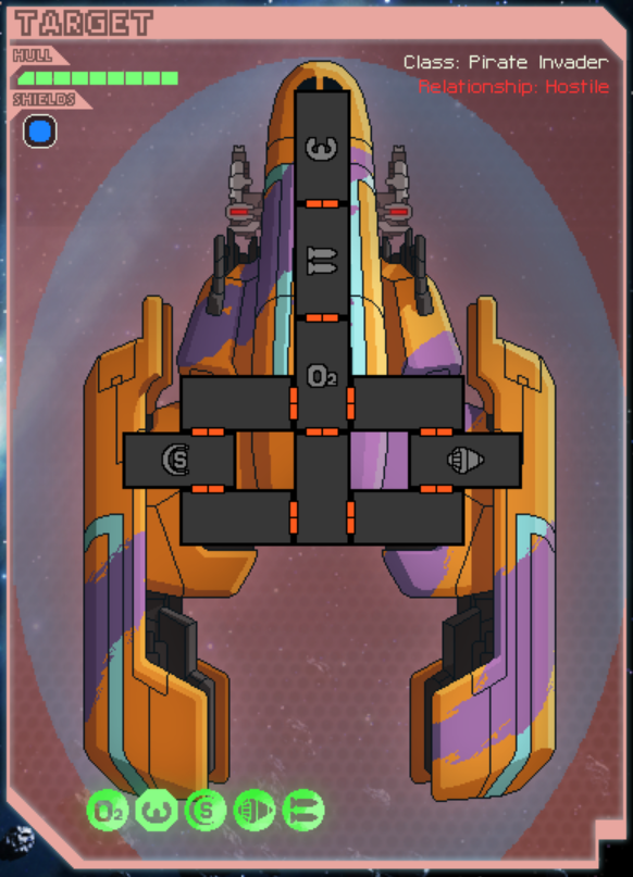
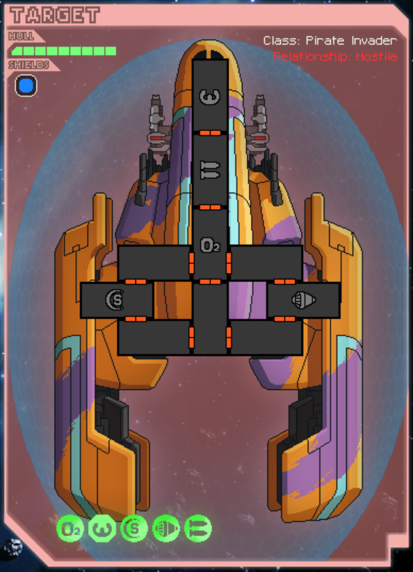
I feel the first one is too dark, but the third one looks pretty good.
Please let me know what you think, as it will be much easier to try out ideas at this early stage!
